Case Study: Giving a Powerful Woman an Equally Powerful Brand
Image: Tiago Battoni, Designer
Virginia Czarnocki is in the business of inspiring life-changing experiences. She believes in a world of opportunity, where people can do or be whatever they want – so long as they believe in themselves and have the courage to go out and get it.
"Coach V", as she is more affectionately known, has no doubt had a positive impact on the Not Your Standard office, despite our collective hatred for the weighted sled at her Industrial Park gym that she in turn lovingly calls "Sally", and we are so thrilled we got the chance to collaborate on the development of her personal brand.
As an ex-lawyer, ex-tertiary army officer, entrepreneur, certified fitness and wellness professional, wife, and mother of three, Virginia is fiercely accomplished and was looking for an overarching brand to showcase her multiple executive coaching, performance programmes, and other wellness-centric business ventures.
Striking a Delicate Balance
We knew we wanted to capitalise on Virginia's prevailing market credibility and stay true to her unique personality, but we also needed to consider her well-established existing brands and ensure the new parent identity stayed versatile for future growth as well as appealed to the diverse, and global, audience it needed to speak to.
Creating a Strong but Approachable Personality
By identifying her key target audiences and getting clear on who the brand was – and what it wanted to inspire in others – we were able to develop four core differentiators that formed the basis of the brand's personality.
We quickly learned that Virginia is not afraid to say it like it is, make mistakes, have a bad day, fall down and get back up again. She gives real-world advice to people who want to change their lives for the better. We created a brand voice that reflects this by being personable and honest, yet confident and inspiring.
A Simple and Timeless Brand
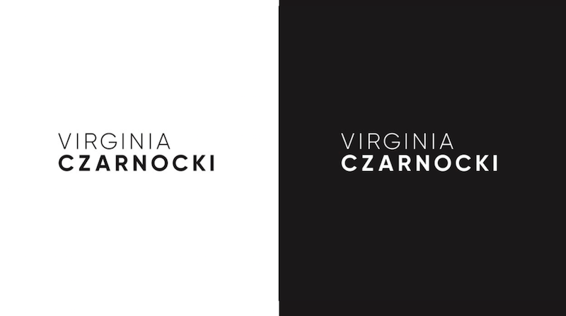
From the core brand narrative, it was essential we developed a strong visual identity that was both high-end and welcoming. A stark black-and white logo puts Virginia on modern ground. The contemporary typeface creates a sleek, yet approachable brand that balances stable confidence with understated simplicity.
A bright colour palette and clean styling communicates openly yet directly, and consistent brand marks, including a positive green performance bar and monochrome scale, endorse the way Virginia transforms the lives of her clients both mentally and physically. The new branding is designed to thoughtfully span across website, social media, marketing materials and business stationery, achieving a distinct look and feel to frame the brand's collection of sub-offerings, leverage the brand's founder and enable future extended reach.


